Hverdagshelten app
A mobile app that makes it easier for people in financially vulnerable situations to find free activities, food distribution, and local support.
Role: UX Designer
Type: Course exam at Noroff autumn/winter 2025
Tools: Figma, FigJam, Canva
Background
The challenge
Information about free support in Norway is scattered across websites, Facebook groups, and posters. This makes it stressful and time-consuming for people to find help when they need it.
The goal
The goal was to create a clear and accessible app that gathers free offers and financial support in one place. Insights from the five W’s & H showed that people in financially vulnerable situations often need quick access to food, activities, and financial support in their everyday lives, but currently have to navigate fragmented and inconsistent sources. The app responds to this by using simple language, reminders, and two tailored user flows for private users and organizations, helping users find relevant support when it matters most and with dignity.
The process
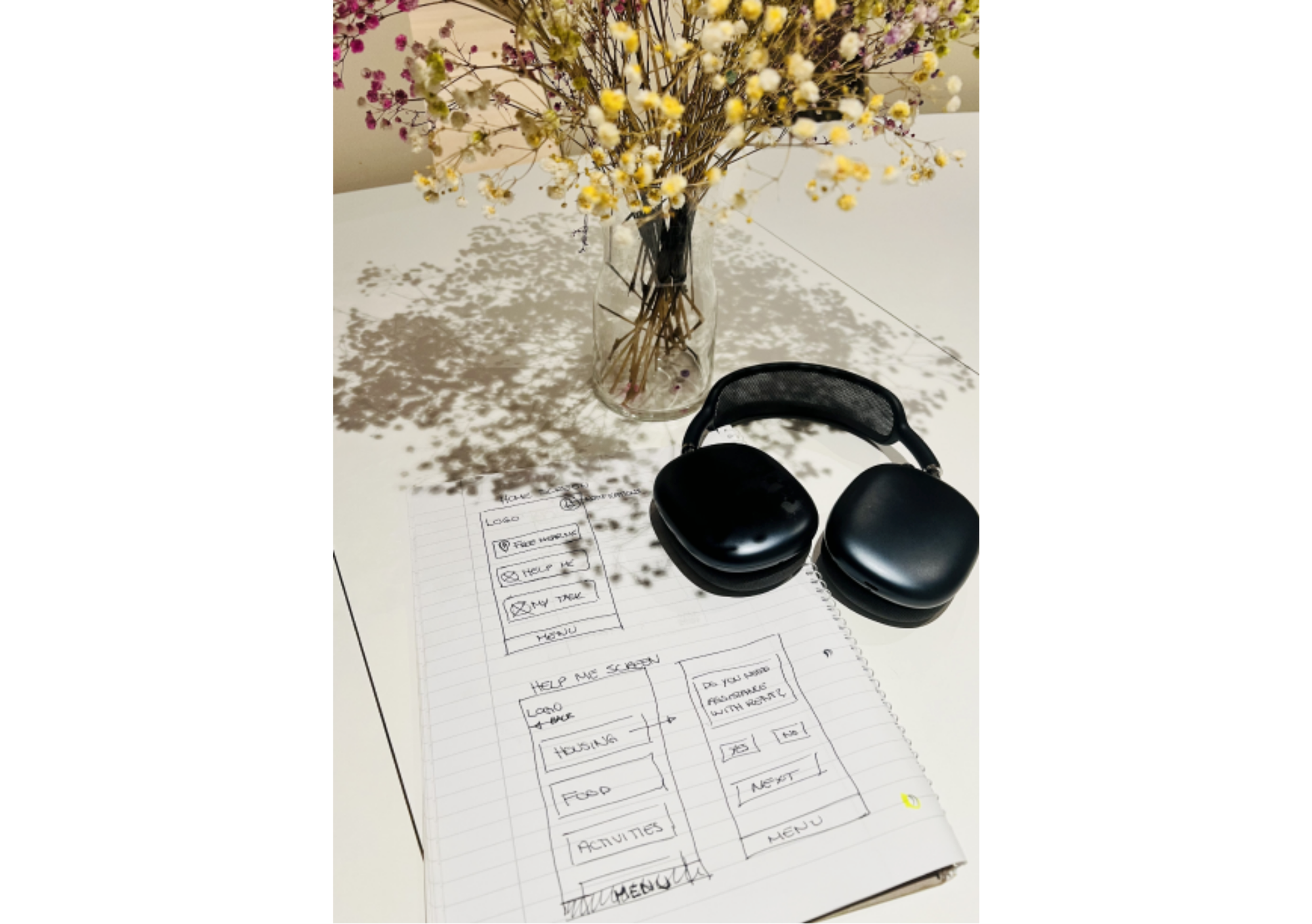
To understand how people find and navigate free local support, we combined surveys, litteratur reviews and competitor analysis. We mapped out the main pain points, defined our primary users, explored multiple concepts, and iterated the UI through prototyping and testing. Below is a snapshot of the process from first insights to final design.
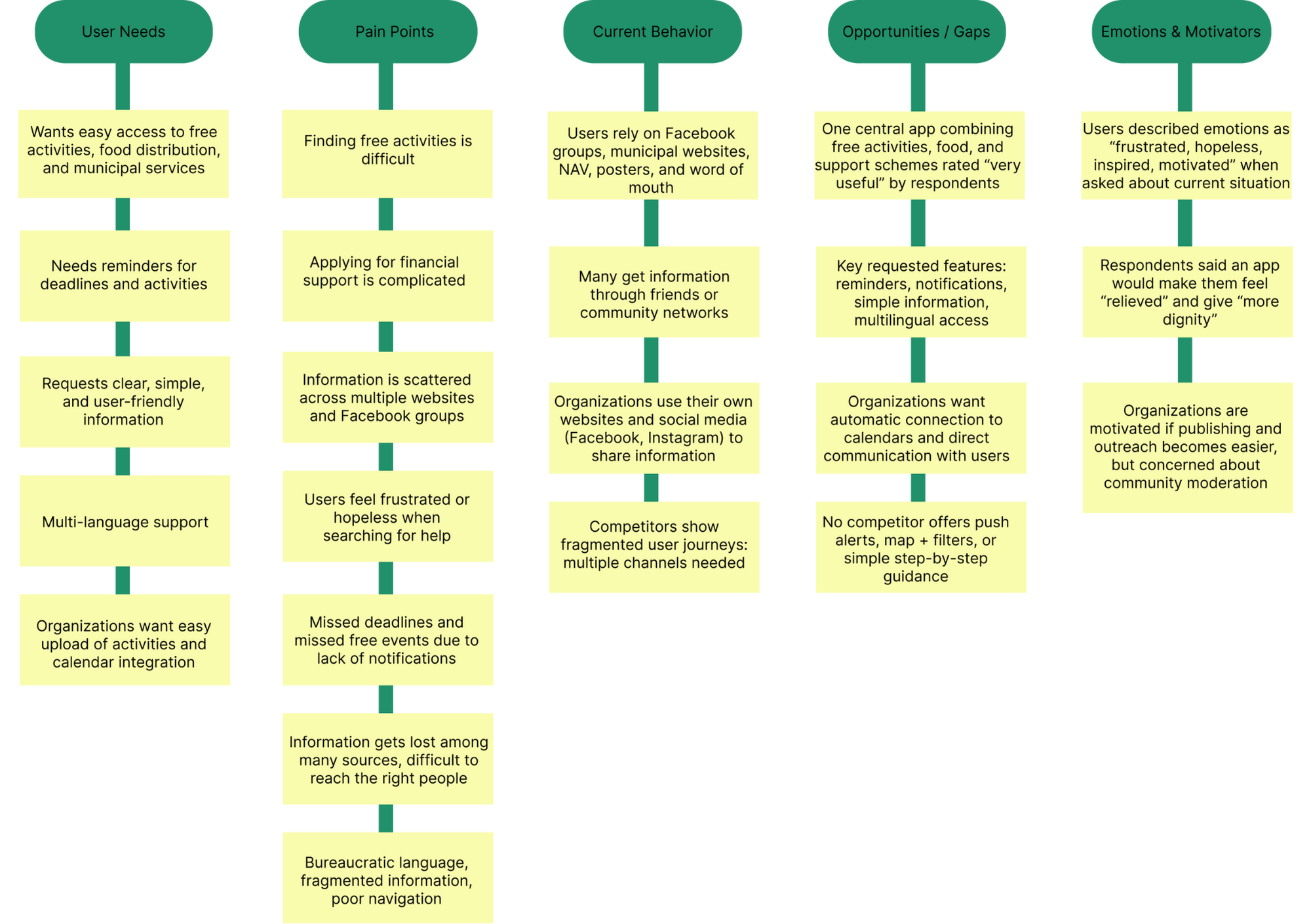
After gathering all the results from the research the affinity mapping confirmed that the problem is not a lack of support or free offers, but rather that information is fragmented, inaccessible, and hard to find in time. This insight became a foundation for our problem statement and guided our design decisions moving forward.
Quote:
I often find out about free events after they happened.
Based on the insights, we defined our primary user, Maria - a single mother who wants free activities and support, but often feels lost navigating fragmented channels. This led to a clear problem statement: people in financially vulnerable situations need one central, easy-to-understand place to find help they qualify for.
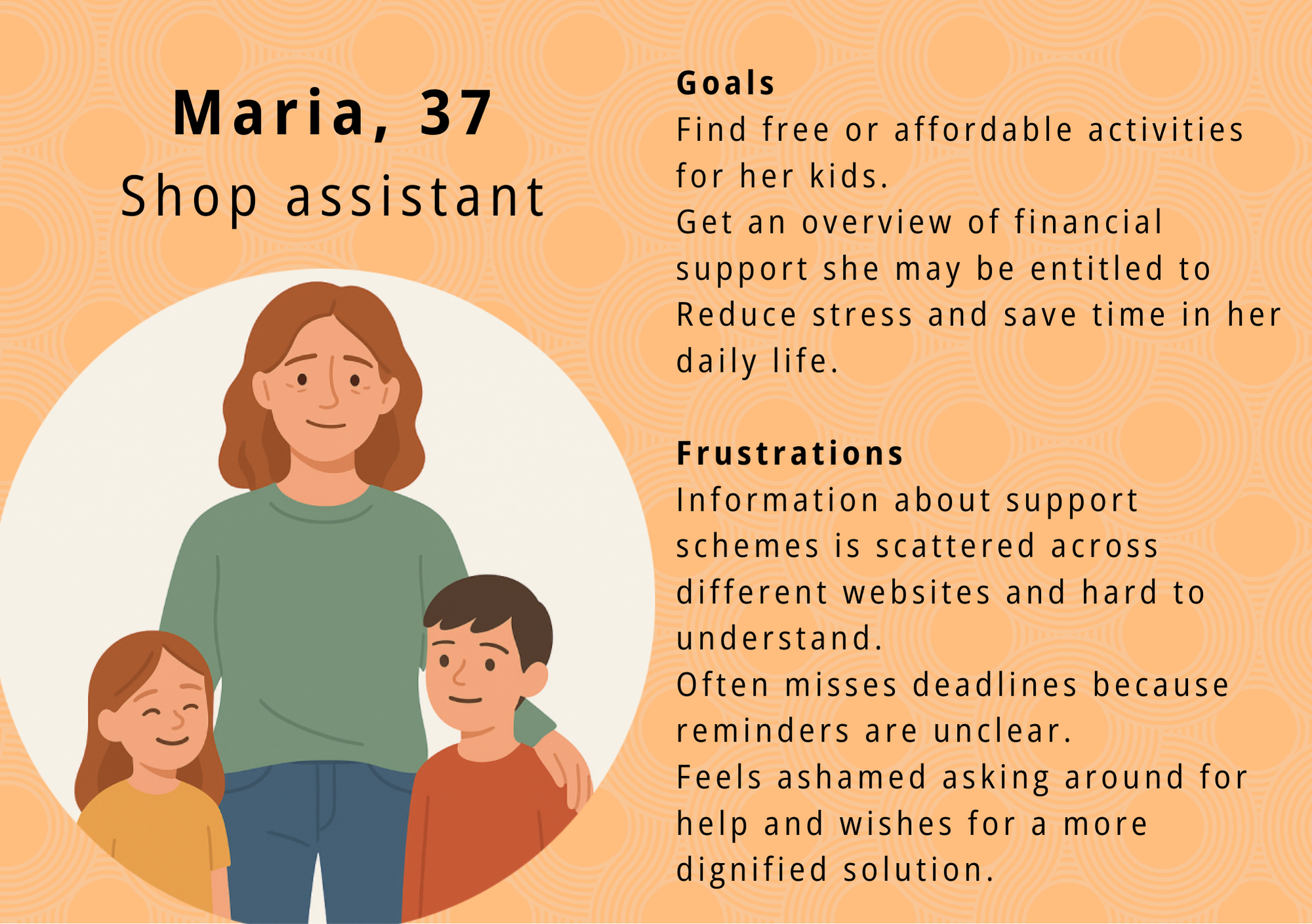
From this, we outlined the core needs that would guide the design: simple language, nearby offers, reminders for deadlines, a clear overview and, most importantly, a dignified and non-stigmatising experience.
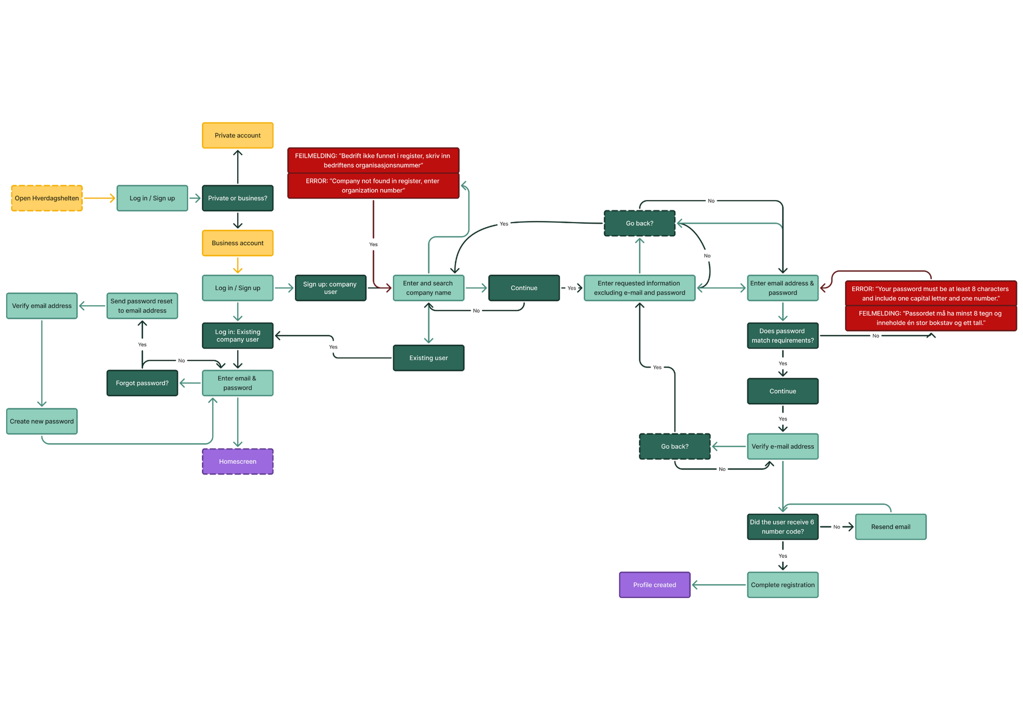
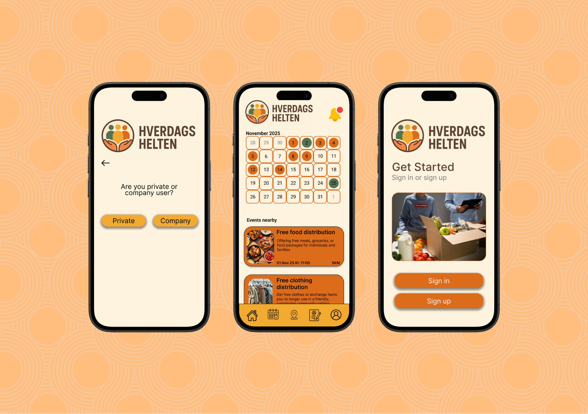
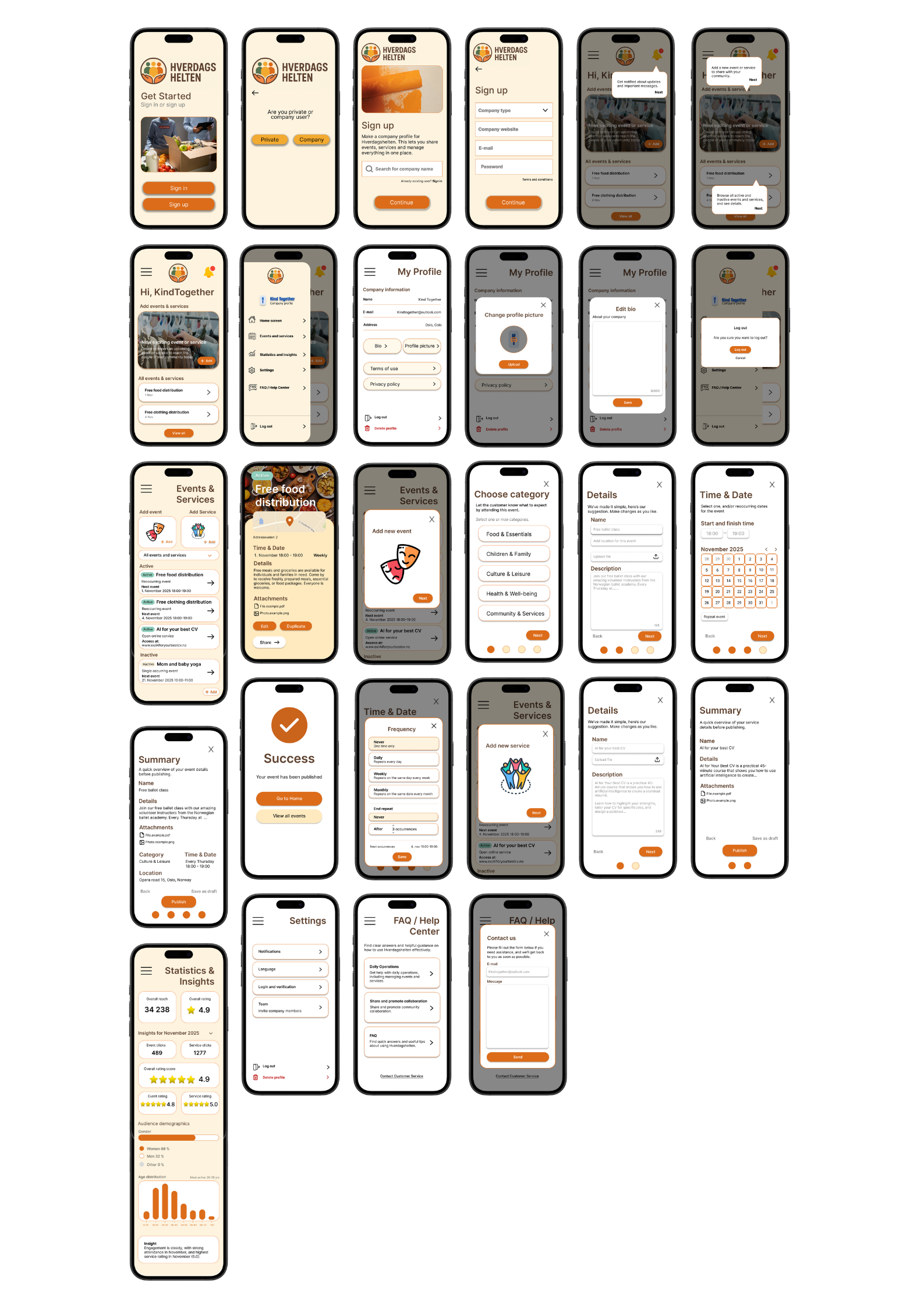
During ideation, we explored a range of concepts through sketching workshops and wireframing. We converged on a structure that balanced clarity and flexibility: a bottom navigation, a hybrid map-list view, step-by-step financial guidance and two tailored user flows - one for private individuals and one for organizations.
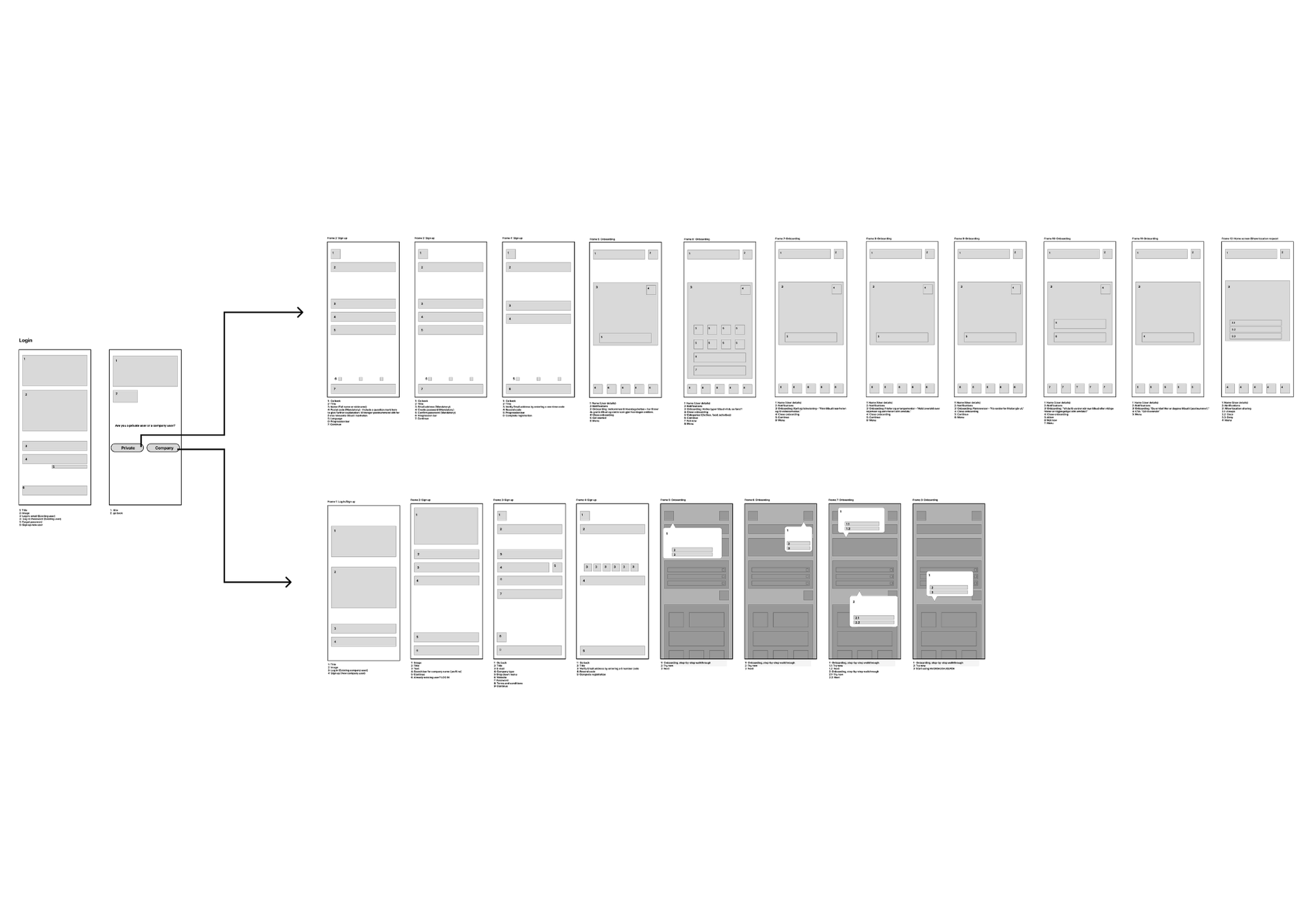
The final information architecture was kept intentionally simple: Home, Categories, Map, Application guidance, Profile. Saved items and reminders became key features to help users keep track of what matters.

Create
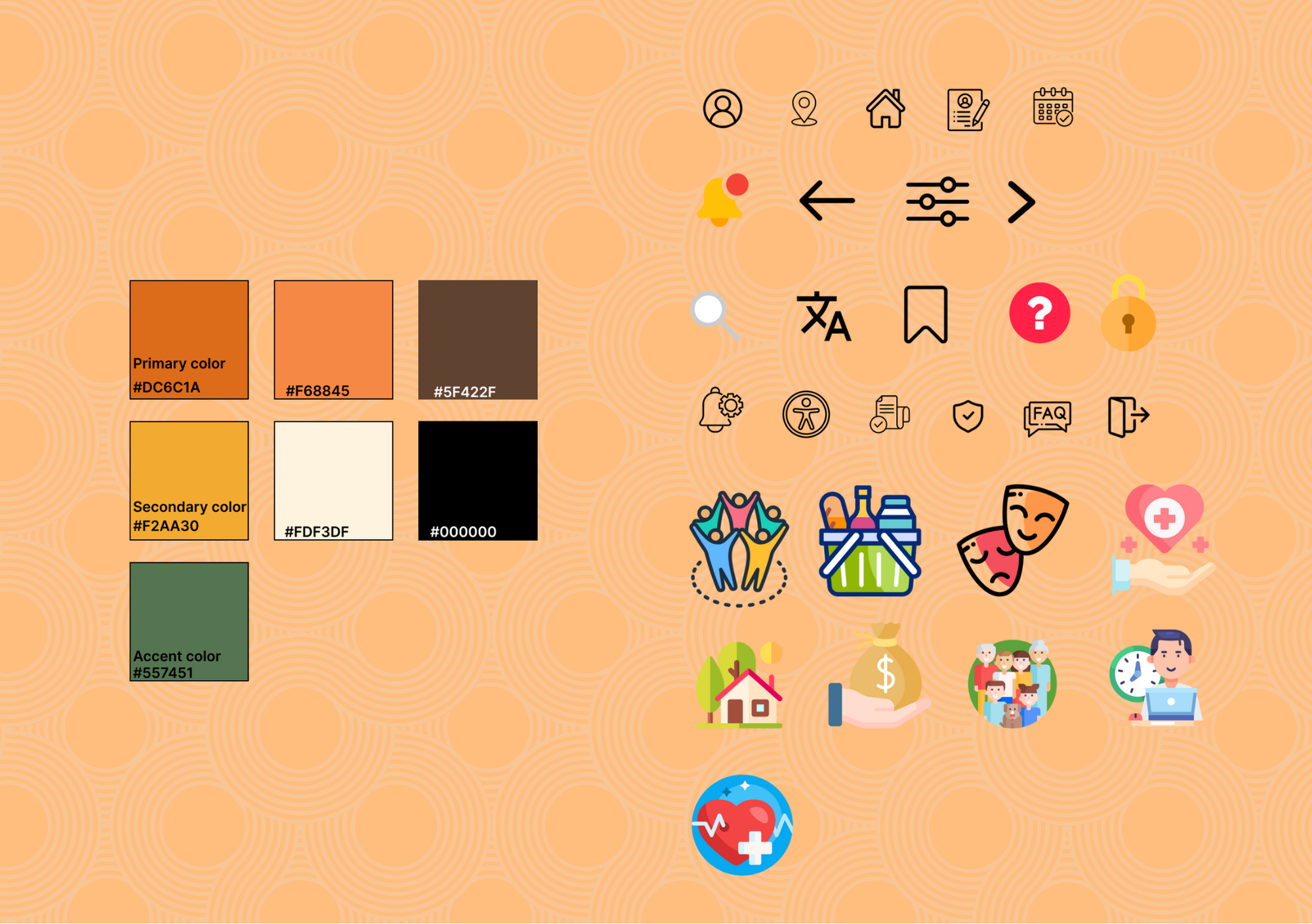
In the prototyping phase, we focused on creating a calm and supportive visual language. A warm palette, accessible typography (Inter), generous spacing and clear iconography were chosen to reduce cognitive load for users who might already feel stressed.
We ensured WCAG-compliant contrast and large touch targets throughout. The high-fidelity prototype brought these decisions together into a solution that feels simple, inclusive and easy to navigate - with clear feedback, reminders and guidance for both private users and organizations.
How testing shaped the final design
We tested both low- and high-fidelity prototypes with users from the target group using task-based usability testing and a think-aloud approach. Participants were asked to complete key tasks such as finding local services, saving events, and navigating application flows.
Key findings
- Some navigation elements and icons were unclear
- Users needed clearer feedback after saving or submitting actions
- The calendar and saved items required better explanation
- Company users lacked confirmation and clarity after publishing events
Changes made
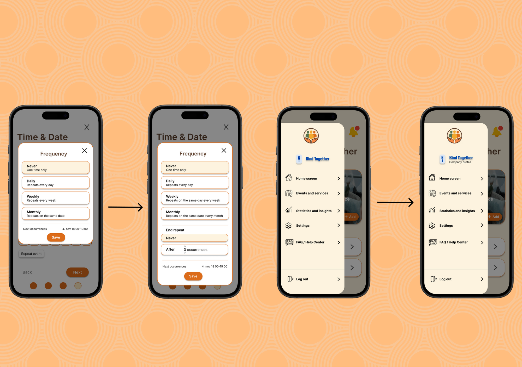
Based on these insights, we improved visual hierarchy, added clearer labels and confirmation states, clarified the calendar functionality, and refined both private and company flows. These iterations reduced confusion, improved confidence, and made the experience more predictable and intuitive.
Result
Based on this, we added clearer labels under icons, a calendar legend, confirmation states for key actions, an “end repeat” option for events and a more readable statistics page for organizations. These small changes had a big impact on clarity and confidence.
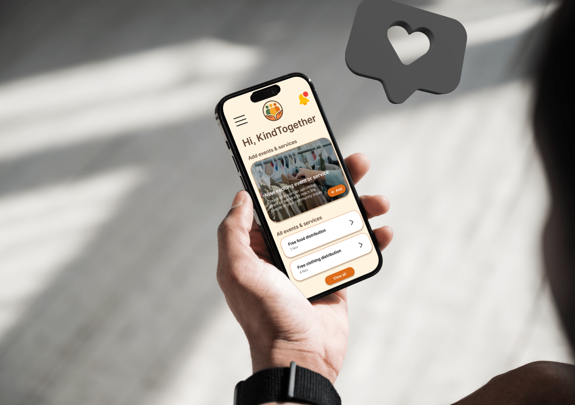
The final design focuses on clarity and simplicity, aiming to reduce cognitive load for users who may already feel stressed when looking for support. A calm visual style, clear hierarchy, and consistent patterns help users navigate the app with confidence and find services in an intuitive and respectful way. For organizations, the company-side experience was designed to be efficient and easy to use, with structured workflows for creating and managing events, clear feedback, and a scalable setup that supports consistent publishing across the platform.
View project exam ↗
Areas for improvement
With more time, I would do more usability testing focused on the company side to catch smaller issues in event creation, editing, and navigation. I would also spend time cleaning up and tightening the structure to make it easier to scale if more features were added later.
My contribution
My main responsibility in this project was the entire company-side experience. I designed the full flow for organizations, from onboarding to publishing events and accessing statistics. This included creating wireframes and high-fidelity screens, developing the information architecture for company users, and designing a clear, intuitive structure for publishing and managing events.
What I have learned
Throughout this project, I learned how much simple language and clear feedback improve usability, especially for users who may feel stressed or overwhelmed. Designing for two user groups taught me the importance of a solid navigation hierarchy, and early testing showed how quickly usability issues can be uncovered and resolved. Overall, the project strengthened my ability to make design decisions grounded in real user needs and to turn research insights into accessible, intuitive solutions.