MoveIt App
Role: UX - designer
Type: Course assignment at Noroff, winter 2025
Tools: Figma, Canva
Background
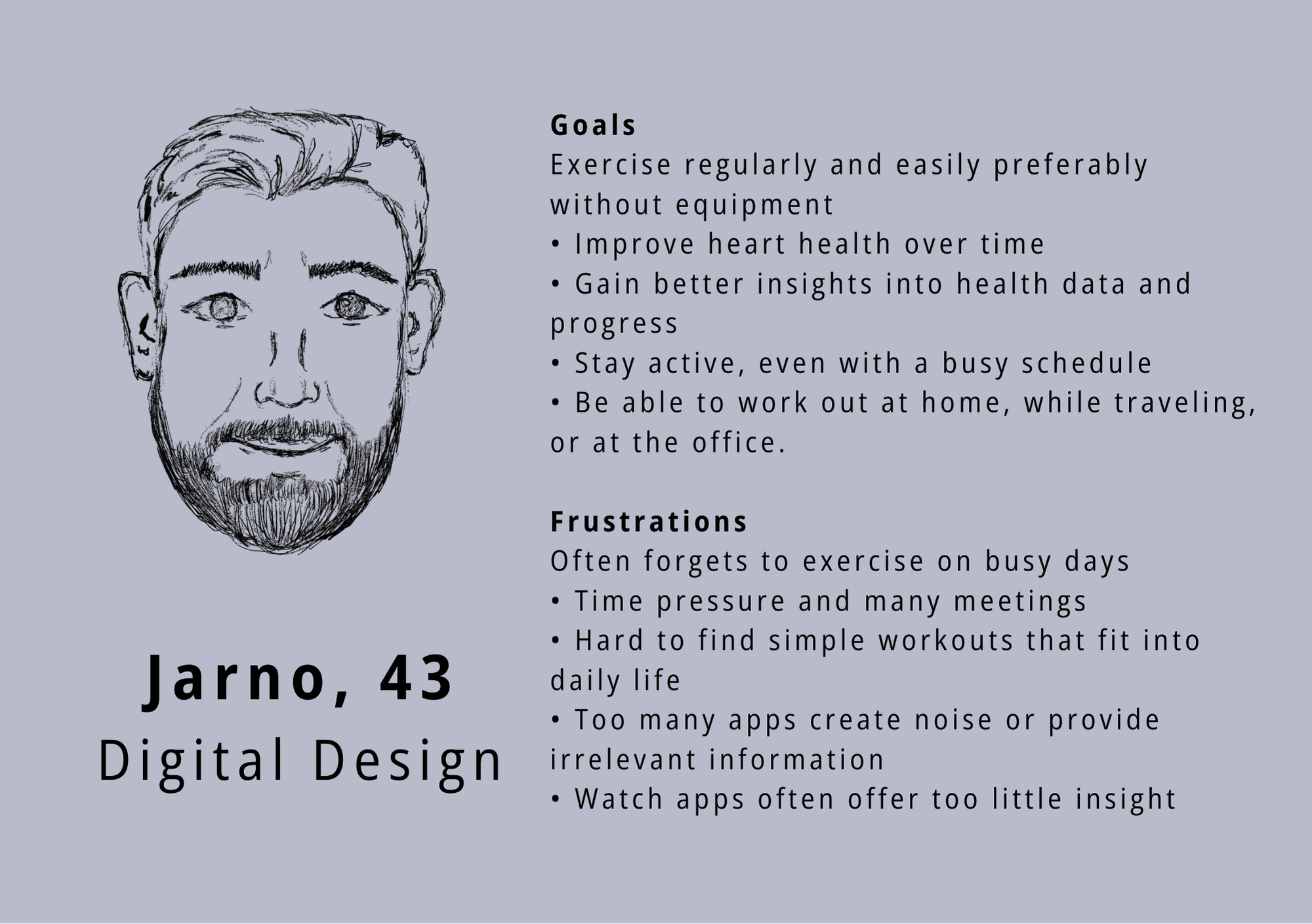
For this course assignment, our group designed a fitness app for both mobile and smartwatch, tailored to the needs of our persona “Jarno”, a busy, tech - savvy design manager. The app helps him stay consistent with simple, no - equipment workouts and track his heart health over time.
The challenge
Staying physically active throughout the day can be difficult when time, motivation, and access to suitable workouts are limited. Users need quick, flexible exercise options that adapt to their daily routines rather than interrupt them.
The goal
The mobile app offers detailed features like workout search and progress tracking, while the smartwatch provides quick access to key stats and reminders. Our goal was to create a seamless, user - friendly experience across both devices, supporting Jarno's active lifestyle.
The process
Using the Design Thinking Process we created Jarno, our persona that we were designing for. This helped us empathize and quickly define the challenges, which led us to come up with ideas.
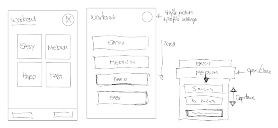
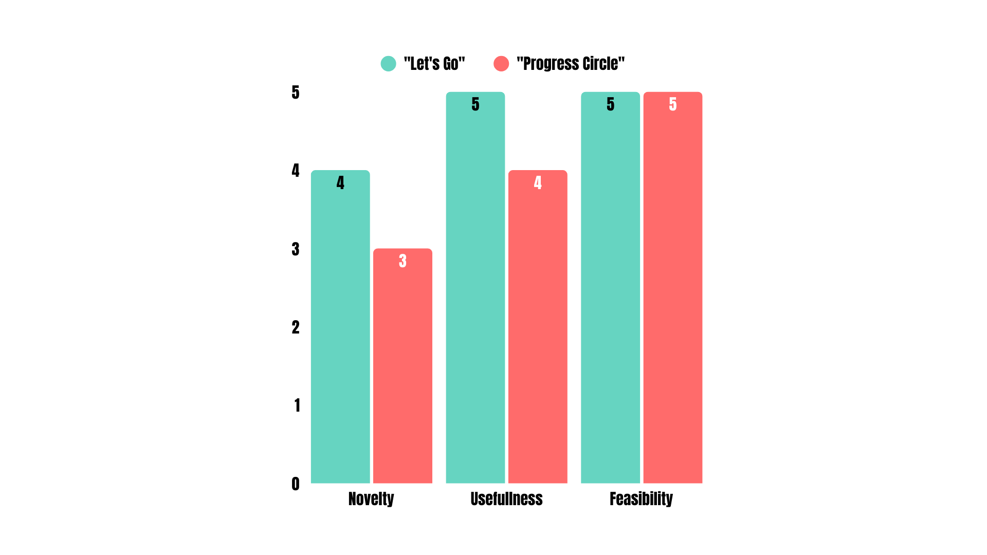
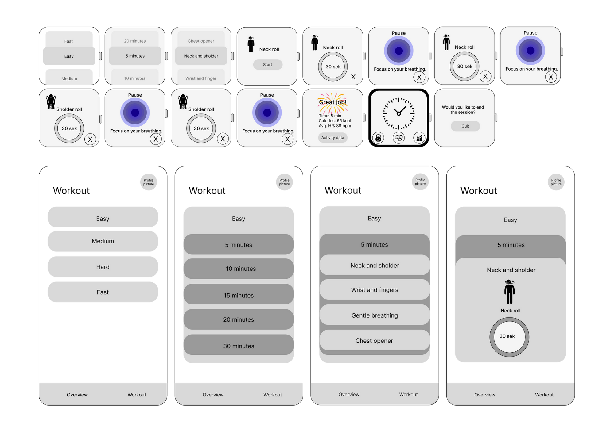
After ideating and sketching, we were down to two low - fi prototypes, and we had to choose one. By applying the NUF technique on our low - fi prototypes, we as a team concluded that we were to go with the one idea for the app.
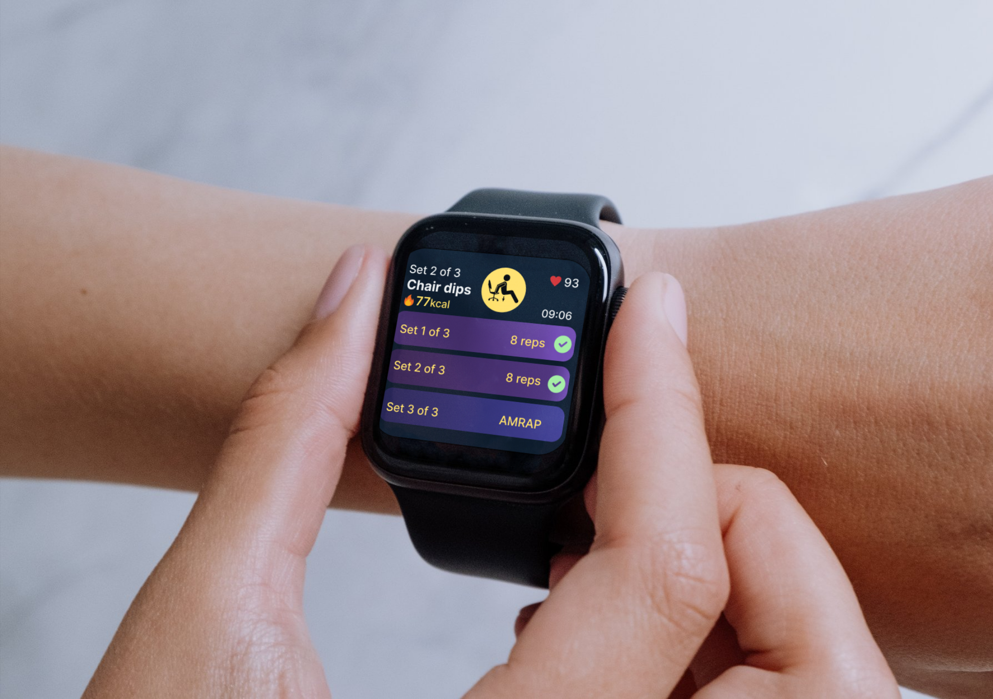
In designing for the smartwatch screen, we prioritized high - contrast, glanceable colours on dark backgrounds. Clearly differentiated colours help users instantly identify interactive elements, reducing cognitive load during quick interactions.
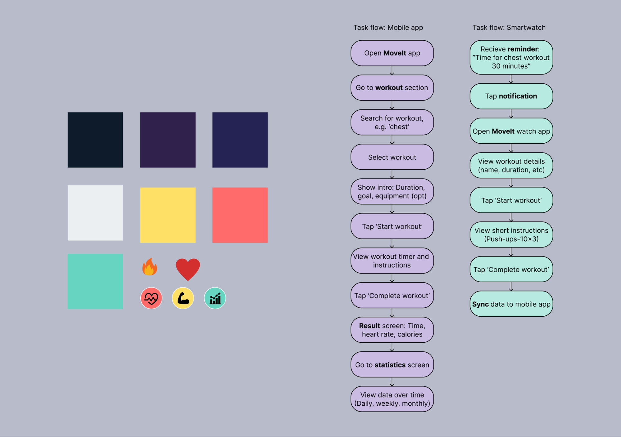
The process began with low-fidelity sketches to explore layout and hierarchy for mobile and smartwatch. Simple block-based wireframes helped define essential content and revealed the limitations of the smartwatch's small screen.
How testing shaped the final design
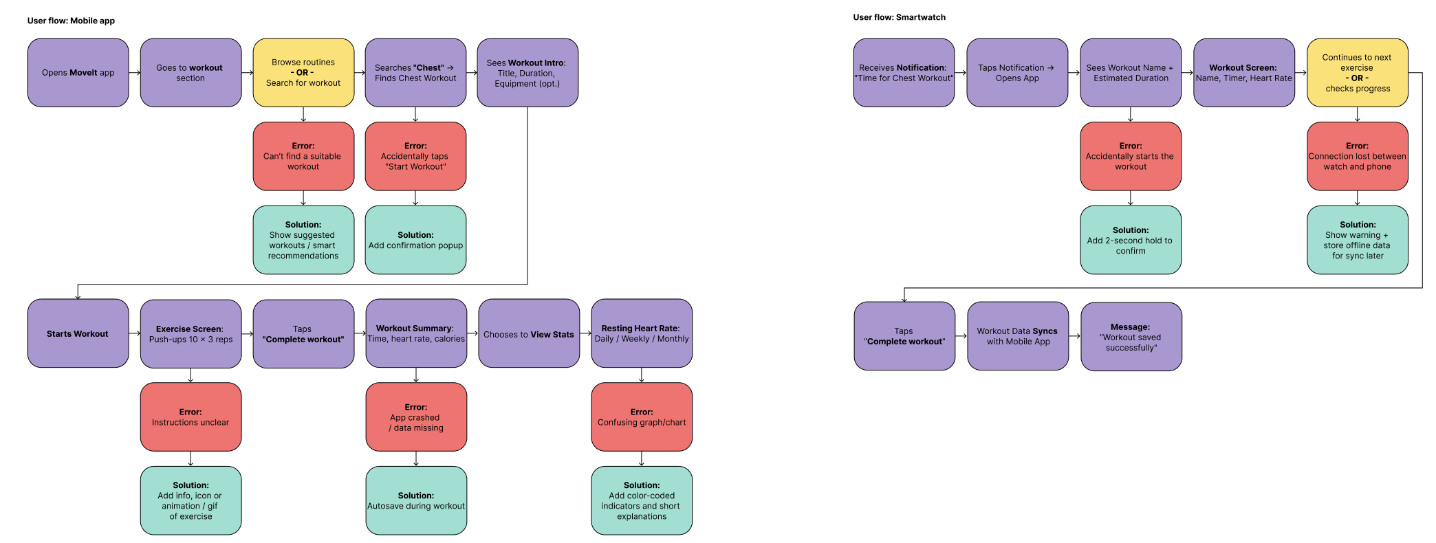
Usability testing of the early smartwatch concepts revealed several issues that affected comfort and ease of use during workouts.
Key findings
- Interface elements were too small to read and tap comfortably
- Navigation felt difficult to use during physical activity
- Users needed a clearer and more natural way to move through content
Based on these insights, the smartwatch interface was redesigned into a scroll-based layout with larger components, allowing users to navigate smoothly using touch or the watch’s side controls. As this approach proved more effective, the same structure was applied to the mobile version to create a more consistent experience across devices. The interface was simplified on both platforms by removing unnecessary complexity and refining the layout to support clarity, quick interactions, and accessibility. These iterations show how testing directly informed design decisions and strengthened the overall usability of the solution.
Result
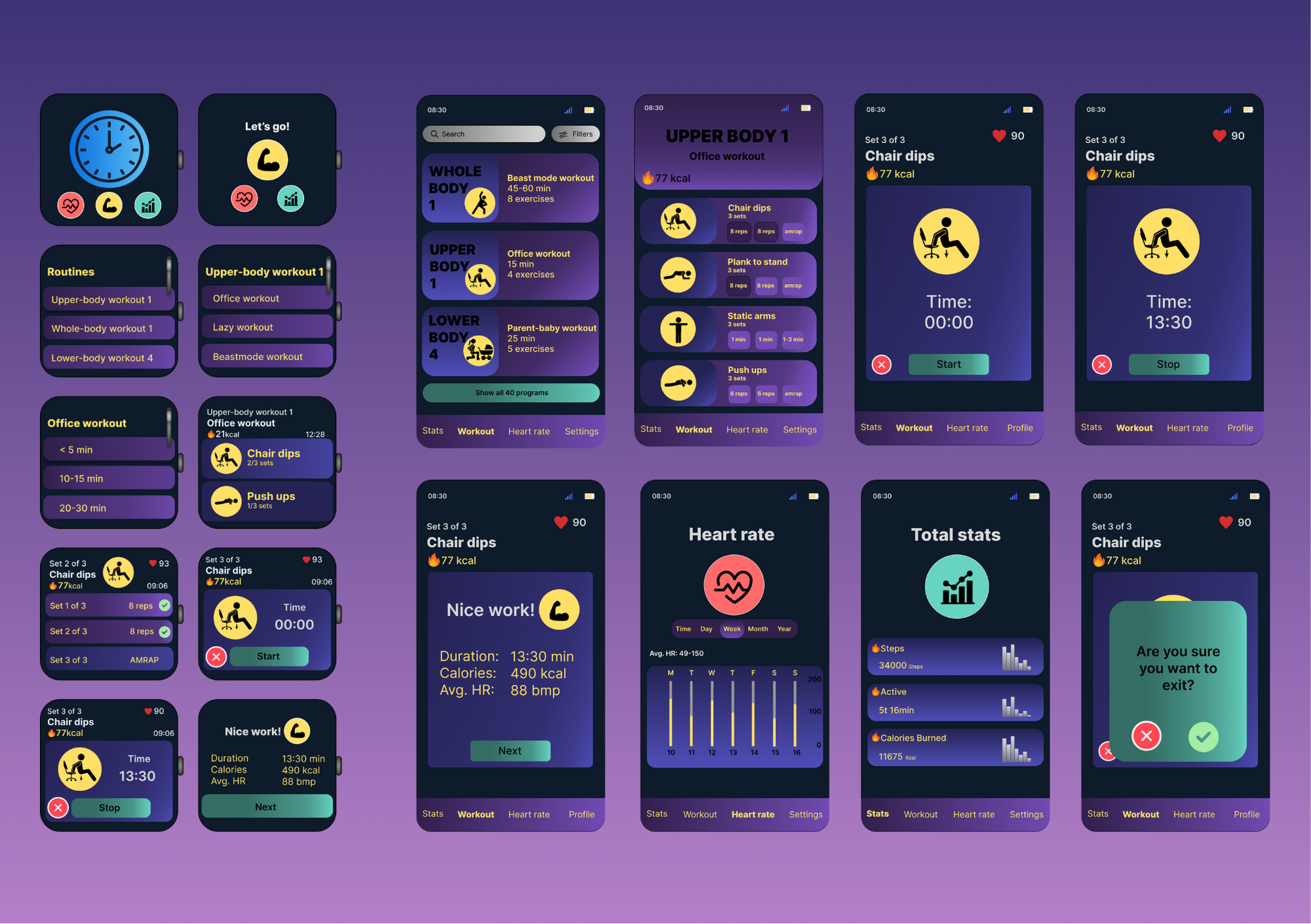
The MoveIt app successfully meets the needs of our tech - savvy persona, Jarno, by delivering a focused and accessible fitness experience across mobile and smartwatch devices. After comparing two design directions, one version emerged as the strongest concept, thanks to its clear visual hierarchy, guided progression, and consistent structure, supporting Jarno's fast - paced lifestyle.
View assignment ↗
Areas for improvement
With more time, I would keep iterating on the experience to balance simplicity with useful functionality and make sure the solution continues to support users in a clear and intuitive way.
My contribution
I contributed across the full design process for the smartphone experience, from early ideation and concept development to the final solution. My work included exploring user flows and interaction patterns, as well as creating and refining both low- and high-fidelity smartphone designs.
During ideation, I used the NUF technique to help assess and refine ideas, and worked iteratively to shape an intuitive and cohesive user experience across platforms.
What I have learned
This project strengthened my skills in multi - device design, accessibility, and user - centered thinking. I gained confidence in applying methods like NUF evaluation to guide decisions, creating glanceable smartwatch interfaces, and collaborating effectively as a team.Overall, it was a great exercise in designing a consistent, intuitive experience across platforms.